

Introduction
Rounded corners on HTML help soften the overall design of a website, giving it a more inviting and user-friendly appearance. We'll examine CSS-created rounded corners in this article.
Steps we'll cover:
- What is CSS border-radius?
- Rounded corners using CSS border-radius
- Elliptical corners using CSS border-radius
- Random corners using CSS border-radius.
- Inverted corners
- Notched corners
What is CSS border-radius?
The border-radius attribute in CSS specifies the radius of a HTML element's corners. The border-radius attribute can have between one and four values.
border-radius: 15px 50px 30px 5px;
- The first value applies to the
top-leftcorner. - The second to the
top-rightcorner. - The third to the
bottom-rightcorner. - The fourth to the
bottom-leftcorner.
The border-radius can be set for all four sides using the shorthand property shown below:
border-radius: 10px;
The border-radius can be set for the top-left-and-bottom-right and top-right-and-bottom-left corners using the shorthand property shown below:
border-radius: 10px 20px;
The border-radius can be set for the top-left , top-right-and-bottom-left, and bottom-right corners using the shorthand property shown below:
border-radius: 10px 20px 30px;
The above examples display that the border-radius attribute can accept a single radius (defined at all the corners). Defining a single radius for the border-radius attribute will form round corners.
Alternatively, the border-radius attribute can also accept two radii to form elliptical corners. An example is shown below:
border-radius: 40px / 10px;
In the sample above, the '/' separates the two radii from each other.
You can also use the shorthand property on the two radii as shown below:
/* (first radius values) / top-left-and-bottom-right | top-right-and-bottom-left */
border-radius: 10px 20px / 20px 30px;

/* (first radius values) / top-left | top-right-and-bottom-left | bottom-right */
border-radius: 10px 5px 15px / 20px 25px 30px;

/* (first radius values) / top-left | top-right | bottom-right | bottom-left */
border-radius: 10px 5px / 20px 15px 30px 35px;
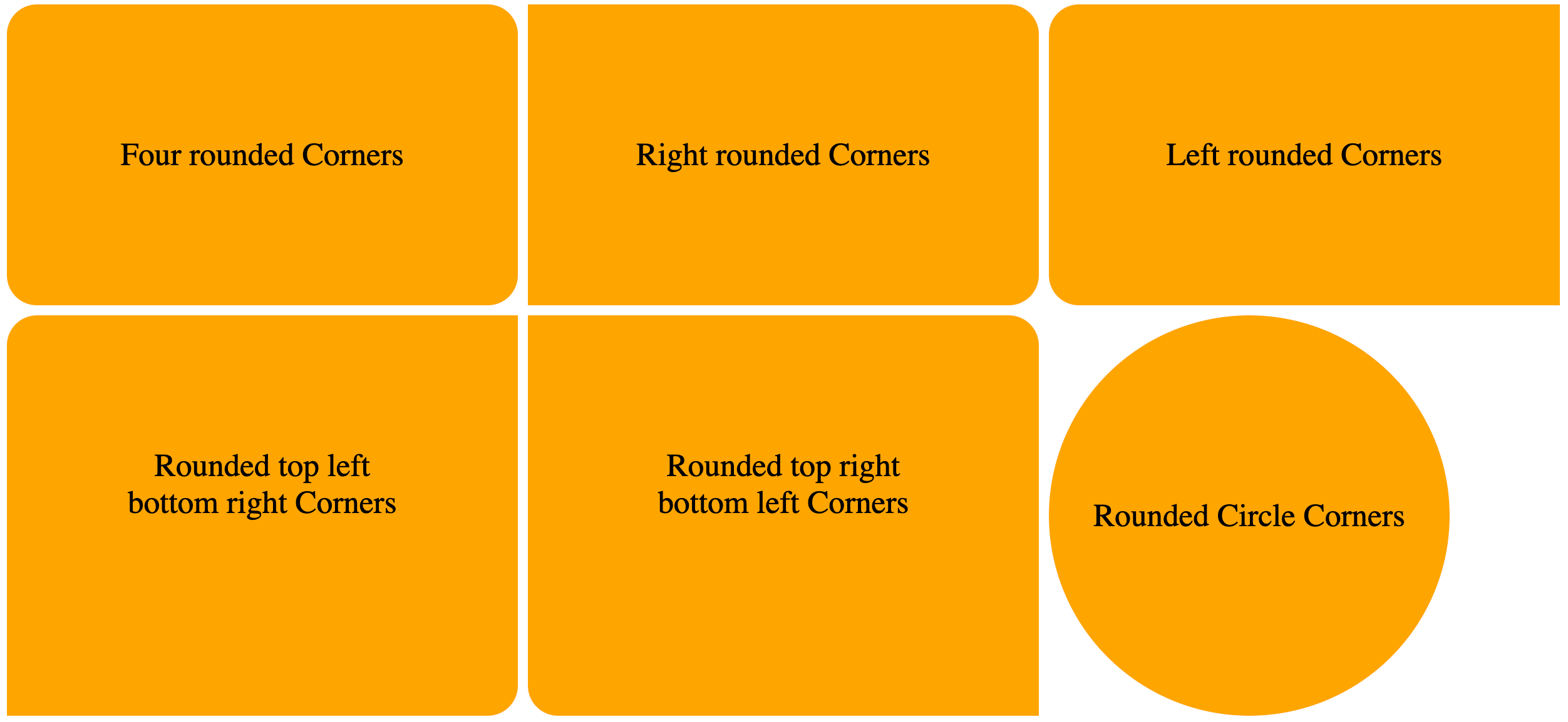
Rounded corners using CSS border-radius
Example:
We will display examples of how to create rounded corners using the border-radius attribute.
HTML:
<html>
  <body>
    <div class="container">
      <div class="four-rounded-corners">
        <p>Four rounded Corners</p>
      </div>

      <div class="rounded-right-corners">
        <p>Right rounded Corners</p>
      </div>

      <div class="rounded-left-corner">
        <p>Left rounded Corners</p>
      </div>

      <div class="rounded-corners-top-left-bottom-right-corners">
        <p>Rounded top left bottom right Corners</p>
      </div>

      <div class="rounded-corners-top-right-bottom-left-corners">
        <p>Rounded top right bottom left Corners</p>
      </div>

      <div class="rounded-circular-corners">
        <p>Rounded Circle Corners</p>
      </div>
    </div>
  </body>
</html>
CSS:
.container {
  display: grid;
  grid-template-columns: 1fr 1fr 1fr;
  grid-gap: 10px;
}

div.four-rounded-corners {
  /* using the shorthand property to set the border radius on all corners */
  border-radius: 30px;
  background: orange;
  padding: 100px;
  text-align: center;
  font-size: 32px;
}

div.rounded-right-corners {
  /* using the shorthand property to set the border radius on the top-right and bottom-right corners */
  border-radius: 0px 30px 30px 0px;
  ...;
}

div.rounded-left-corner {
  /* using the shorthand property to set the border radius on the top-left and bottom-left corners */
  border-radius: 30px 0px 0px 30px;
  ...;
}

div.rounded-corners-top-left-bottom-right-corners {
  /* using the shorthand property to set the border radius on the top-left and bottom-left corners */
  border-radius: 30px 0px 30px 0px;
  ...;
}

div.rounded-corners-top-right-bottom-left-corners {
  /* using the shorthand property to set the border radius on the top-right and bottom-left corners */
  border-radius: 0px 30px;
  ...;
}

div.rounded-circular-corners {
  width: 400px;
  height: 400px;
  /* dynamically setting the radius of the corners to be 50% -- half the width and height of the element */
  border-radius: 50%;
  background: orange;
  font-size: 32px;
  display: grid;
  place-items: center;
}
VIEW:
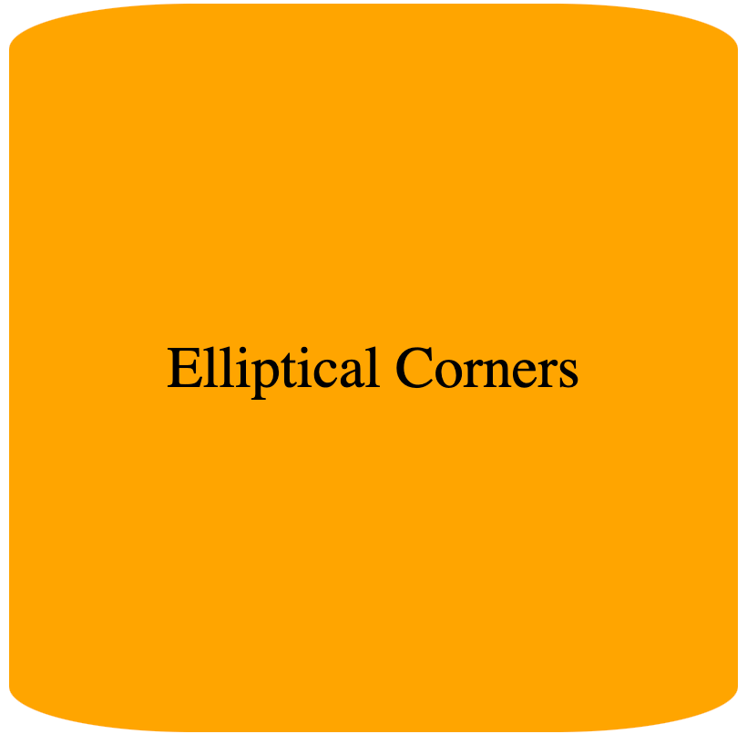
Elliptical corners using CSS border-radius
We will display examples of elliptical borders using CSS border-radius. To create elliptical corners, the border-radius attribute will contain two radii.
Elliptical corners are recognized by the majority of modern browsers. Nonetheless, -webkit versions might be useful for browsers that don't support CSS3 (elliptical corners aren't supported by older versions of -mos-border-radius).
Example
We will create a cylinder-like shape using two radii on the border-radius property.
HTML:
<html>
  <body>
    <div>Elliptical Corners</div>
  </body>
</html>
CSS:
div {
  width: 400px;
  height: 400px;
  border-radius: 100px / 25px; /* setting the 2 radii in the property */
  background: orange;
  font-size: 32px;
  display: grid;
  place-items: center;
}
VIEW:
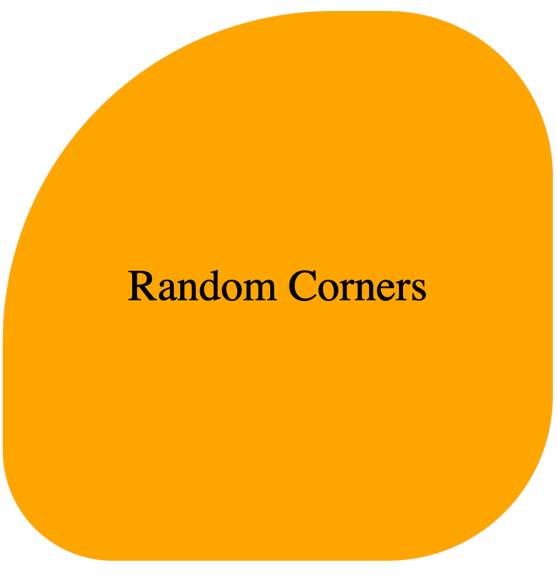
Random corners using CSS border-radius.
We will display examples of random borders using CSS border-radius.
Example 1
We will create a blob-like shape using the radius defined on the border-radius property.
HTML:
<html>
  <body>
    <div>Elliptical Corners</div>
  </body>
</html>
CSS:
div {
  width: 400px;
  height: 400px;
  border-radius: 60% 30% 30% 20%
    /* setting the radius in percentages for random corners */;
  background: orange;
  font-size: 32px;
  display: grid;
  place-items: center;
}
VIEW:
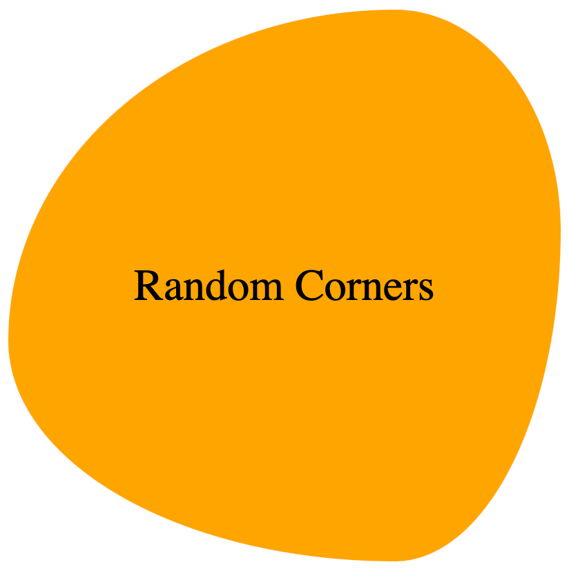
Example 2:
We will create a blob like shape using the 2 radii defined on the border-radius property.
CSS
div {
  width: 400px;
  height: 400px;
  border-radius: 70% 30% 30% 70% / 60% 40% 60% 40%;
  background: orange;
  font-size: 32px;
  display: grid;
  place-items: center;
}
VIEW:
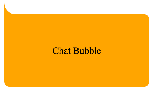
Inverted corners
The basic idea for making an inverted corner is to make a pseudo element, remove the border-radius from the corner on the div (bearing the pseudo element) where we want to add the inverted corner, and then cut a border-radius out of that pseudo element.
Next, we use a box-shadow to give the pseudo element's shadow the same color as the parent div element.
Example:
We will create a chat bubble using the idea of inverted corners.
HTML:
<html>
  <body>
    <div>Chat Bubble</div>
  </body>
</html>
CSS:
div {
  margin-top: 50px;
  position: relative;
  width: 200px;
  height: 80px;
  /* background of main div*/
  background: orange;
  padding: 20px;
  border-radius: 0px 8px 8px 8px;
  display: grid;
  place-items: center;
}

div:before {
  content: "";
  position: absolute;
  top: -40px;
  left: 0;
  height: 40px;
  width: 40px;
  background: transparent;

  /* border-radius of pseudo element */
  border-bottom-left-radius: 50%;

  /* box shadow to give the shadow of the pseudo-element the same color as the background */
  box-shadow: 0 20px 0 0 orange;
}
VIEW:
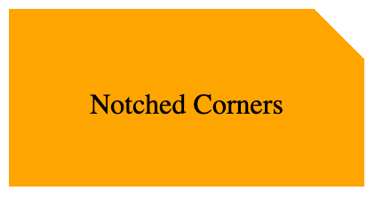
Notched corners
We will display examples of notched borders using CSS.
Example 1:
The basic idea for making an notched corner in this example is as follows:
- Create a
pseudoelement from adivelement, - Collapse the
pseudoelement on the section of thedivwhere you want to make the notched corner. - Create a
boxshadow on thepseudoelement. - Set
overflow: hiddenon thedivelement to conceal the overflowing bits of its child elements. - Use the
box-shadowof the pseudo-element to fill the background of the parentdivelement.
We will create a partly truncated div element using the idea of notched corners.
HTML:
<html>
  <body>
    <div class="notched-corner">
      <p>Notched Corners</p>
    </div>
  </body>
</html>
CSS:
div.notched-corner {
  position: relative;
  width: 200px;
  height: 100px;
  background-color: transparent;
  overflow: hidden;
}

div.notched-corner:before {
  content: "";
  position: absolute;
  left: 90%;
  top: -20%;
  width: 40px;
  height: 40px;
  transform: rotate(45deg);
  background-color: transparent;
  box-shadow: 0 0 0 250px orange;
}

p {
  position: absolute;
  top: 35%;
  left: 50%;
  width: 100%;
  text-align: center;
  transform: translate(-50%, -35%);
}
VIEW:
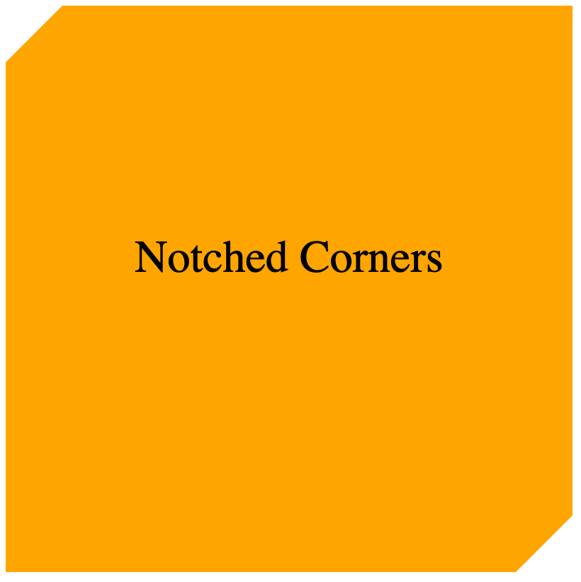
Example 2:
The clip-path parameter specifies which section of an element should be shown. It can be combined with the polygon() method to form a notched corner (or complex shapes).
HTML:
<html>
  <body>
    <div class="notched-corner">
      <p>Notched Corners</p>
    </div>
  </body>
</html>
CSS:
div.notched-corner {
  position: relative;
  width: 400px;
  height: 400px;
  overflow: hidden;
  background: orange;
  clip-path: polygon(
    0 10%,
    10% 0,
    90% 0,
    100% 0%,
    100% 90%,
    90% 100%,
    0% 100%,
    0% 90%,
    0% 10%
  );
}

p {
  position: absolute;
  top: 35%;
  left: 50%;
  width: 100%;
  text-align: center;
  transform: translate(-50%, -35%);
  font-size: 32px;
}
VIEW:
Conclusion
In this article, we discussed numerous approaches for building different sorts of corners utilizing CSS features like border-radius, pseudo-elements, box-shadow, clip-path, and many others. With this information, you can construct a variety of visually appealing and inviting designs for your websites or web applications.